This class serves as a brief introduction to visualization using ggplot2, which is constructed based on the grammar of graphics and provides a structured way to think about and create graphs.
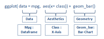
A basic graph has three main components, or “layers,” as shown in Fig. 1. These main layers are:
Data: The dataset you want to visualize
Aesthetics: Mapping variables to visual characteristics, e.g., x-axis, y-axis, color, shape, etc.
Geometry: The type of graphics, e.g., points, lines, bars.
Fig. 1: ggplot2 standard syntax (retrieved from listendata.com)
You can make your graph more beautiful by adding more layers, including
Facets: Dividing the data into subplots based on a variable, such as creating two graphs for females and males.
Theme: Adjusting the overall appearance of the plot.
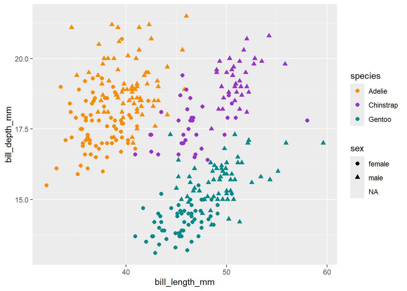
Do you recall the penguins data and a graph we used in our first R class? Let’s look at the graph again and figure out the layers.
First, we load the packages and the penguins data.
library(tidyverse) # ggplot2 is included in tidyverse
Warning: package 'tidyverse' was built under R version 4.3.3
Warning: package 'dplyr' was built under R version 4.3.3
Warning: package 'stringr' was built under R version 4.3.3
Warning: package 'lubridate' was built under R version 4.3.3
── Attaching core tidyverse packages ──────────────────────── tidyverse 2.0.0 ──
✔ dplyr     1.1.4     ✔ readr     2.1.5
✔ forcats   1.0.0     ✔ stringr   1.5.1
✔ ggplot2   3.5.2     ✔ tibble    3.2.1
✔ lubridate 1.9.4     ✔ tidyr     1.3.1
✔ purrr     1.1.0
── Conflicts ────────────────────────────────────────── tidyverse_conflicts() ──
✖ dplyr::filter() masks stats::filter()
✖ dplyr::lag()    masks stats::lag()
ℹ Use the conflicted package (<http://conflicted.r-lib.org/>) to force all conflicts to become errors
Warning: Removed 11 rows containing missing values or values outside the scale range
(`geom_point()`).
In this graph, we started plotting the layers within ggplot(). The layers are:
Data: penguins
Aesthetics: In this layer, we use aes() to specify the variable to use as the x-axis and the variable to use as the y-axis. Here, the x is the bill length of penguins, and y is the bill depth.
Geometry: The function geom_point plots a scatterplot, presenting the relationship between bill length and depth. Within it, we can further specify aesthetics using aes(). So, you see that the color and shape of the data points are defined based on the species groups. Finally, the data point size is set to 2.
Lastly, we used scale_color_manual() to specify the colors assigned to each group.
See, we made a graph just like making a cake with layers! Notice that all the layers are coded within the ggplot() function, assembled by “+.”
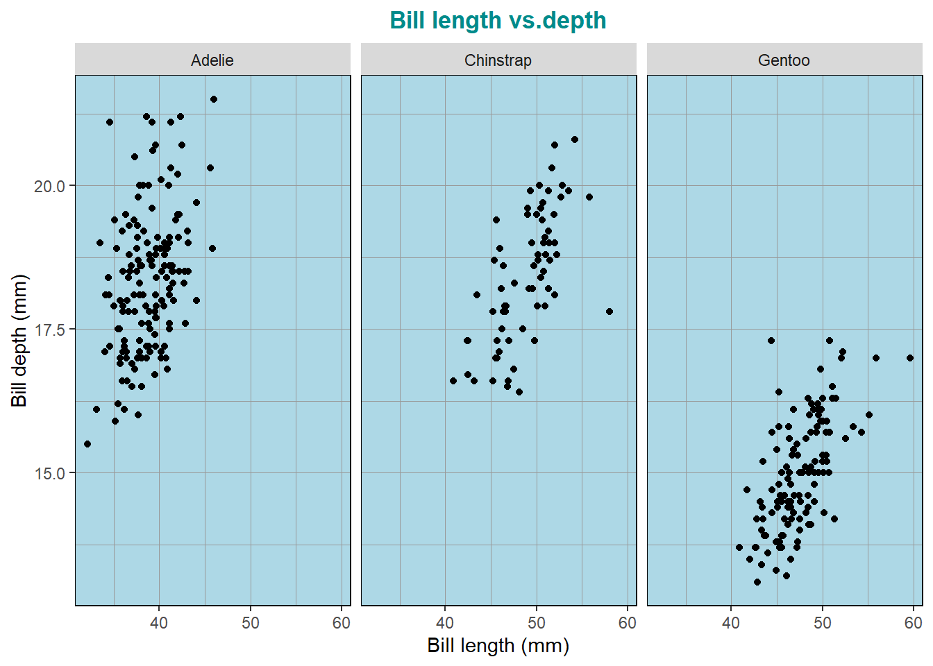
An alternative way to show the relationship by species is to make a separate scatterplot for each species by faceting (e.g., facet_wrap). Further, we can add the main and axis titles and modify the plot theme using theme().
Warning: The `size` argument of `element_line()` is deprecated as of ggplot2 3.4.0.
ℹ Please use the `linewidth` argument instead.
Warning: Removed 2 rows containing missing values or values outside the scale range
(`geom_point()`).
In this class, we won’t go into the details of the theme layer, which has tons of elements to work on. You can find a very organized learning material of ggplot2 theme elements created by Henry Wang (see here) to customize your graph arts.
2 Types of graphs
It is crucial to pick the right way to present our data. We need to consider the data type, such as discrete and continuous, and match it with what we want to show the reader.
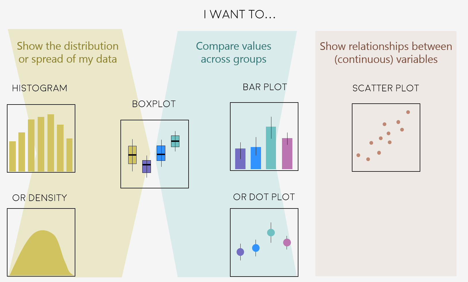
Fig.1 shows a few common graphs that satisfy most data visualization tasks. In the following, we will walk through how to make these plots.
Fig. 1 Some common plots (retrieved from ourcodingclub)
2.1 Scatter plot
As you’ve seen above, we used scatterplots to visualize the relationship between two continuous variables, bill_length_mm and bill_depth_mm.
Activity 1
Can you plot another scatterplot using the penguins data set?
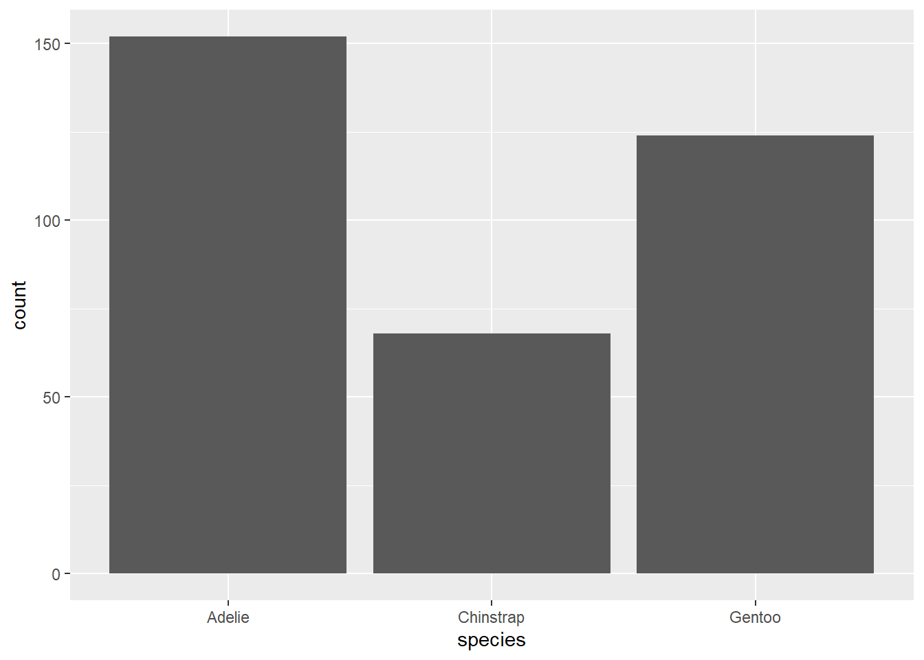
2.2 Bar chart
Bar charts are commonly used to compare discrete or categorical variables. In other words, we use bar charts to show different values across groups. The corresponding function in ggplot2 is geom_bar.
ggplot(penguins, aes(x=species)) +geom_bar()
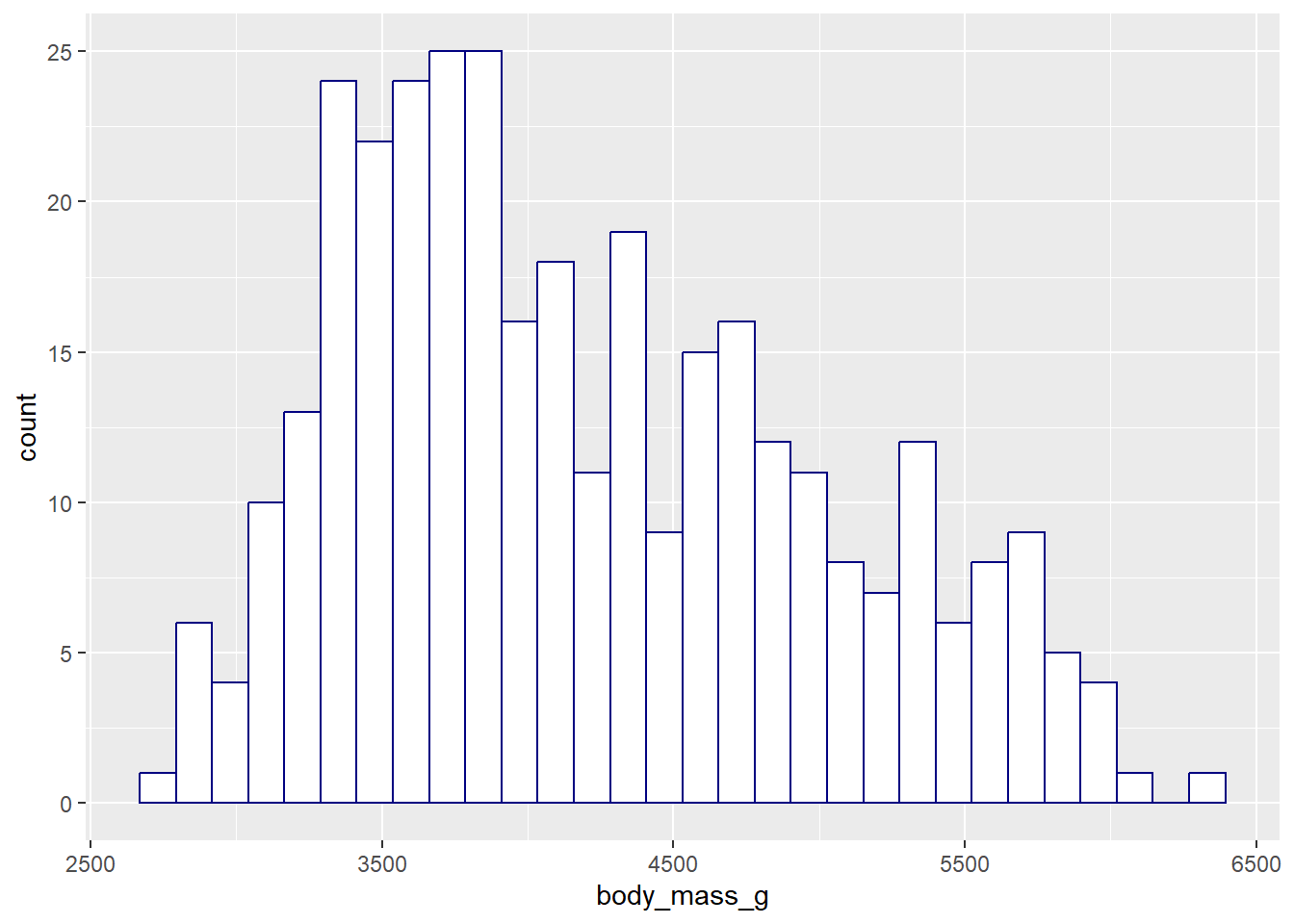
2.3 Histogram
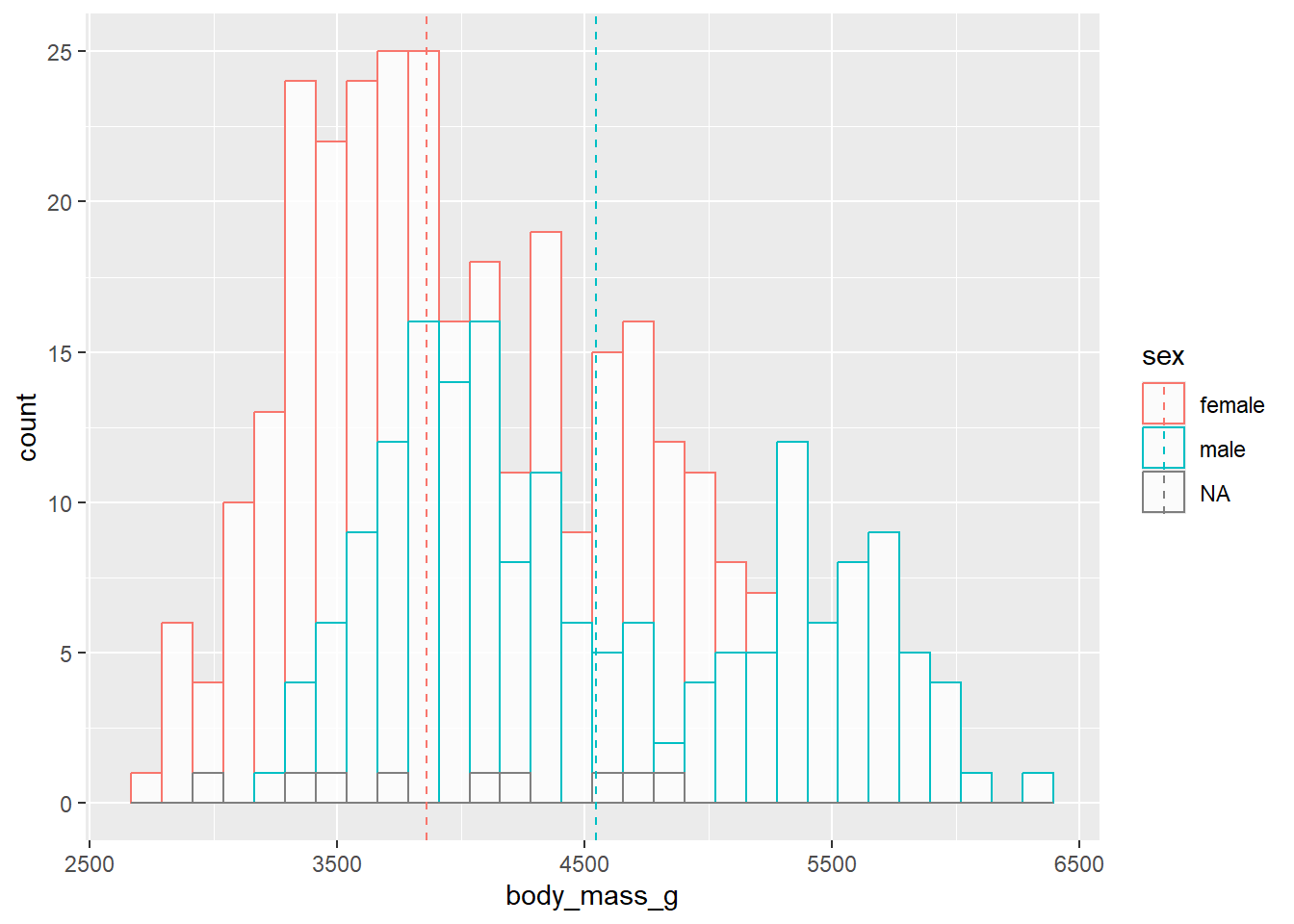
We use histograms to depict the frequency distribution of a continuous variable. The corresponding function is geom_history.
Warning: Removed 2 rows containing non-finite outside the scale range
(`stat_boxplot()`).
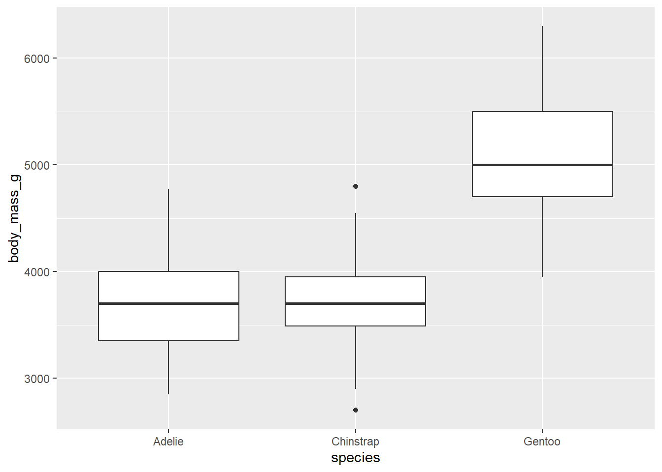
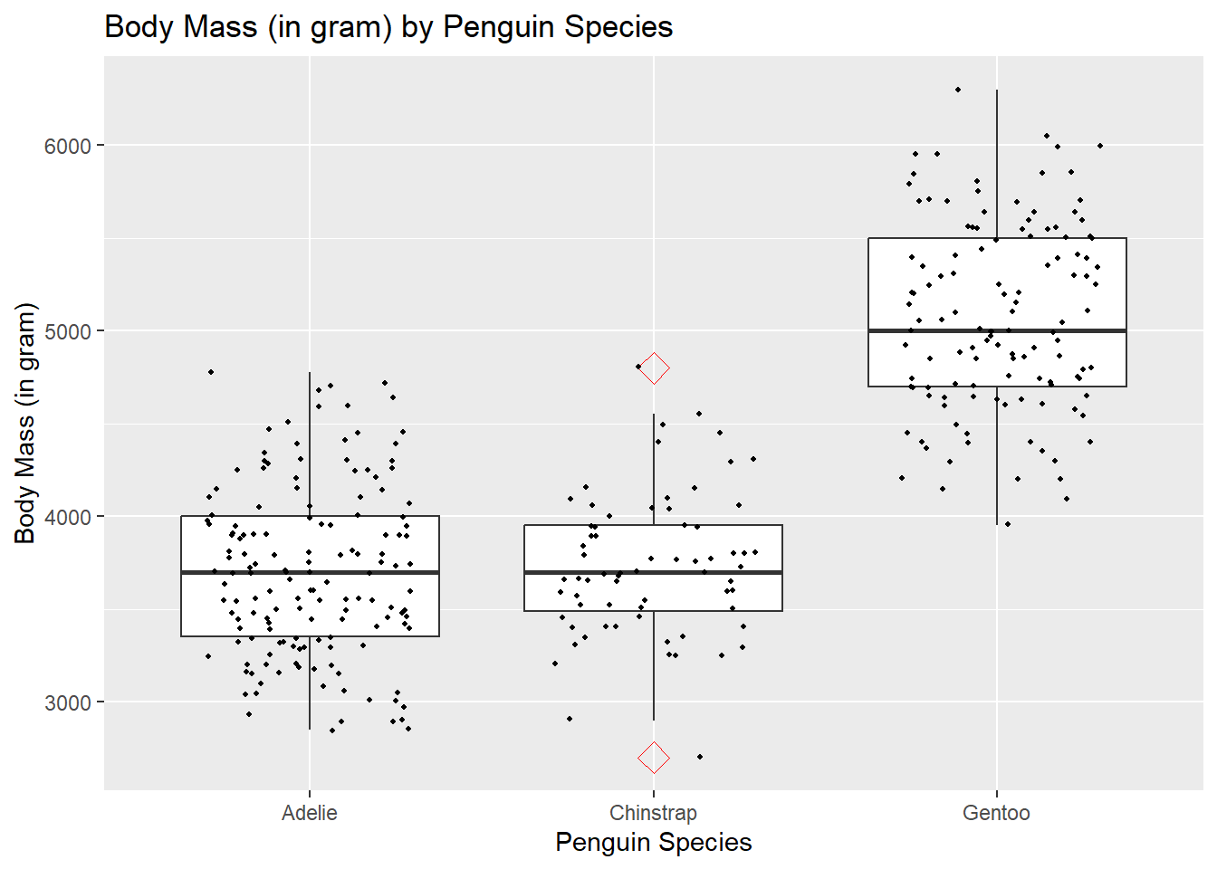
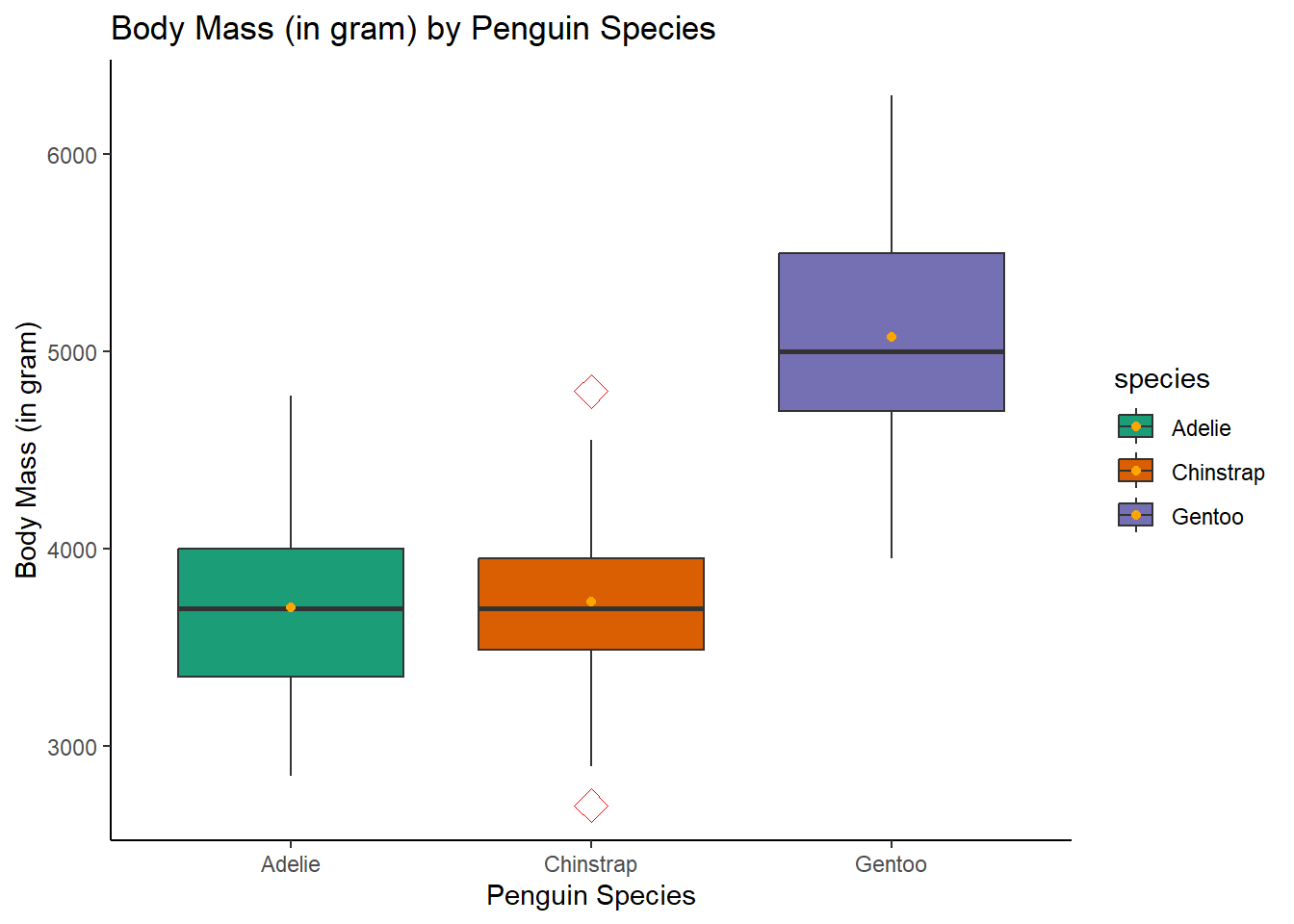
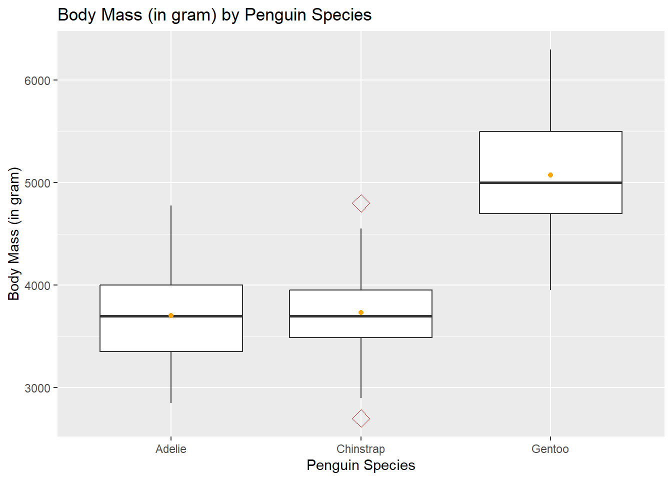
The box represents the interquartile range (IQR), capturing the middle 50% of the data. The line inside of the box marks the median.
Whiskers extend to the minimum and maximum values within a specified range, revealing the overall data spread. Outliers are data points that lie significantly beyond the whiskers.
ggplot(penguins, aes(x=species, y=body_mass_g))+geom_boxplot(outlier.colour="red", outlier.shape=5,outlier.size=4)+geom_jitter(size=0.8, width =0.3)+labs(title="Body Mass (in gram) by Penguin Species",x="Penguin Species", y="Body Mass (in gram)")
Warning: Removed 2 rows containing non-finite outside the scale range
(`stat_boxplot()`).
Warning: Removed 2 rows containing missing values or values outside the scale range
(`geom_point()`).
Activity 2
There are many other types of plots. Can you find out the functions of plotting line charts and pie charts?
3 What else
3.1 Picking colors
When it comes to choosing colors for your plots, we can manually assign the color to control the aesthetics precisely.
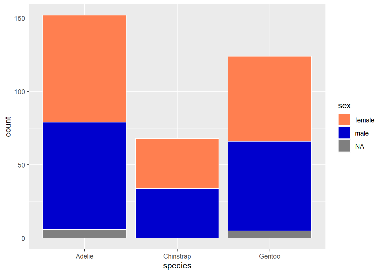
ggplot(penguins, aes(x=species)) +geom_bar(aes(fill=sex), position ="stack", color="white")+scale_fill_manual(values=c("coral", # the color name"#0000CD",# the HEX value"grey"))
Alternatively, you can tap into the vast world of R color palettes by exploring resources like RColorBrewer or viridis, providing a wide array of pre-defined color schemes.
ggplot(penguins, aes(x=species, y=body_mass_g, fill=species))+# add fill argumentgeom_boxplot(outlier.colour="red", outlier.shape=5,outlier.size=4)+labs(title="Body Mass (in gram) by Penguin Species",x="Penguin Species", y="Body Mass (in gram)")+stat_summary(fun.y=mean, geom="point", color="orange")+scale_fill_brewer(palette="Dark2") +# fille the color from the "Dark2" palettetheme_classic()
Warning: The `fun.y` argument of `stat_summary()` is deprecated as of ggplot2 3.3.0.
ℹ Please use the `fun` argument instead.
Warning: Removed 2 rows containing non-finite outside the scale range
(`stat_boxplot()`).
Warning: Removed 2 rows containing non-finite outside the scale range
(`stat_summary()`).
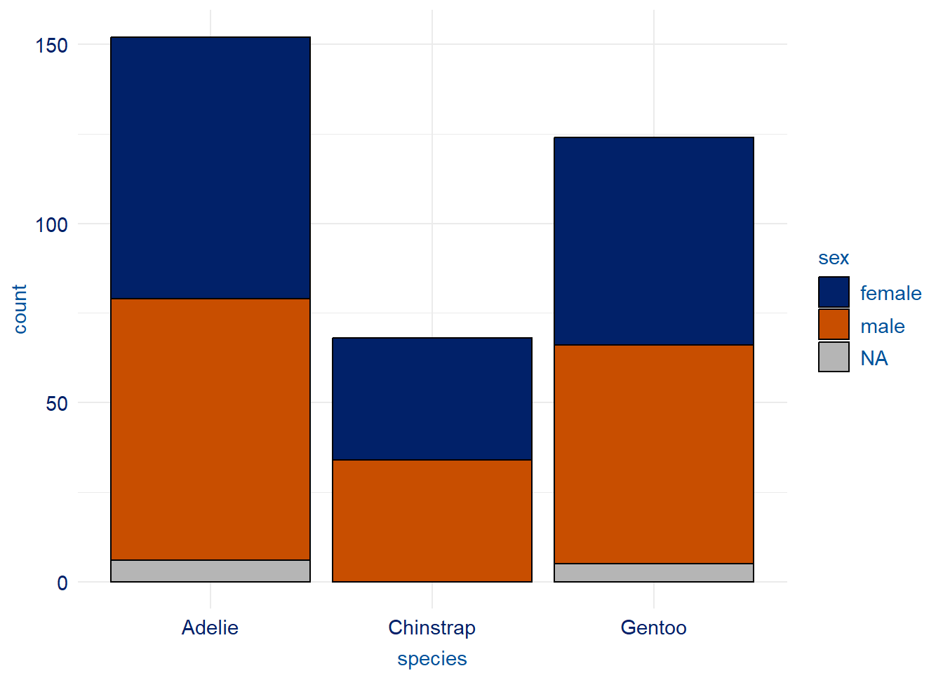
Lastly, ensure your visuals are accessible to a diverse audience. For example, you should consider inclusivity by opting for color-blind-friendly choices. The following example uses a package, duke, to do this task.
#install.packages("duke")library(duke)
Warning: package 'duke' was built under R version 4.3.3
ggplot(penguins, aes(x=species)) +geom_bar(aes(fill=sex), position ="stack", color="black")+scale_duke_fill_discrete() +theme_duke()
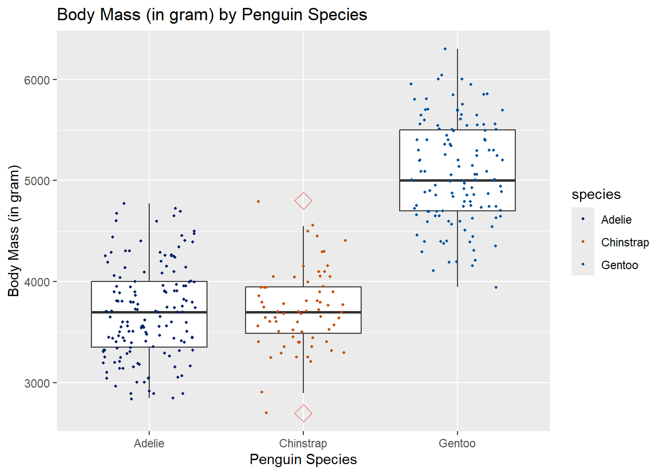
ggplot(penguins, aes(x=species, y=body_mass_g))+geom_boxplot(outlier.colour="red", outlier.shape=5,outlier.size=4)+geom_jitter(aes(color=species),size=0.8, width =0.3)+labs(title="Body Mass (in gram) by Penguin Species",x="Penguin Species", y="Body Mass (in gram)")+scale_duke_color_discrete()
Warning: Removed 2 rows containing non-finite outside the scale range
(`stat_boxplot()`).
Warning: Removed 2 rows containing missing values or values outside the scale range
(`geom_point()`).
3.2 Add summary statistics
In practice, we may want to summarize the data and add them to the plot. The following examples demonstrate two such scenarios.
In the first example, we want to add a line indicating the mean of body mass by sex. In this case, we can create a new data set with the summary statistics and attach it to the graph.
`stat_bin()` using `bins = 30`. Pick better value with `binwidth`.
Warning: Removed 2 rows containing non-finite outside the scale range
(`stat_bin()`).
Warning: Removed 1 row containing missing values or values outside the scale range
(`geom_vline()`).
In the second example, we use the function stat_summary()to compute the statistics directly instead of creating a new data set.
ggplot(penguins, aes(x=species, y=body_mass_g))+geom_boxplot(outlier.colour="red", outlier.shape=5,outlier.size=4)+labs(title="Body Mass (in gram) by Penguin Species",x="Penguin Species", y="Body Mass (in gram)")+stat_summary(fun.y=mean, geom="point", color="orange")
Warning: Removed 2 rows containing non-finite outside the scale range
(`stat_boxplot()`).
Warning: Removed 2 rows containing non-finite outside the scale range
(`stat_summary()`).
3.3 Export and (re-)load your graphs
3.3.1 Export
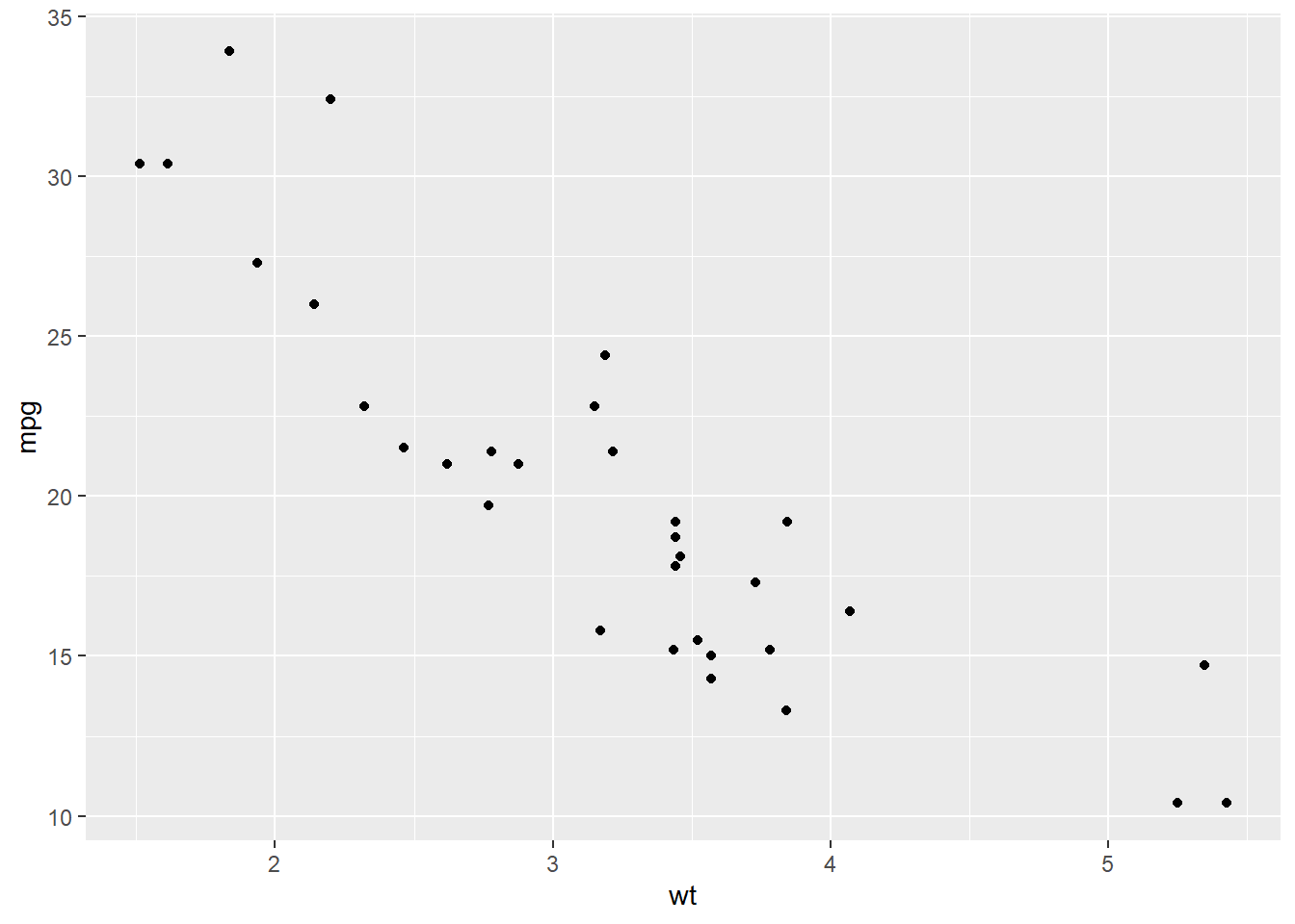
A quick way to save a freshly made graph (without creating it as an object in your R environment) is to run ggsave immediately.
ggplot(mtcars, aes(wt, mpg)) +geom_point()
ggsave("a quick scatterplot.pdf" ) # making a file name of this graph and saving it into a pdf file. You can save it into a png file by name it as ".png"
Saving 7 x 5 in image
You can also save your graph as rdata or rds files if it is created into a graphical object.
scatterplot<-ggplot(penguins, aes(bill_length_mm, y = bill_depth_mm)) +geom_point()save(scatterplot, file="scatterplot.rdata")
If you further want to export this graphical object into an image file with a specific size and resolution, we can modify the above ggsave() codes.
ggsave("Specified scatterplot.pdf", plot=scatterplot, # bg=NULL, # setting the background color to be nulldpi="print", # plot resolution, either numeric input (e.g.,180, 300, etc ) or string (i.e., retina, print, and screen) width=50, # setting the exported image width height =40 , # setting the exported image heightunits ="mm"# Note that the default scale is inch. We can customize it to other scales. )
Warning: Removed 2 rows containing missing values or values outside the scale range
(`geom_point()`).
3.3.2 Load
Loading a graphical object is intuitive. We use load() since it is still an R object.
load(file="mtcars_scatterplot.rdata")
Activity 3
Pick one or two graphs we made above, and customize them as you like!
3.4 Beyond ggplot2
In this class, we showed how to make basic graphs for a few common graph types (e.g., histogram, pie chart, etc.) and how to save and export them. ggplot2 is a powerful data visualization tool, which can be utilized to make loads more beautiful plots. You can explore the handful functions of each layer in its reference documents (click here) and get inspired from the R Graph Gallery!
In later sessions, we will have more practice in making graphs. We will also use new types of variables, such as text, and new types of graphs, such as word clouds and networks. In those practices, we will explore graphical functions from packages other than ggplot2. Here are two great resources on ggplot2 extensions: a gallery and an awesome list of more ggplot2 related packages.